Lesson 7
How to Read a Stock Chart
Updated Sep 2, 2026 · Reviewed by Terence Scott, founder
- Chart Types
- Line, bar, candlestick
- Each Candle Shows
- Open, high, low, close
- Key Additions
- Volume, moving averages
- Core Skills
- Trend, support/resistance
- Level
- Beginner
On this page
A price chart is the market's memory — every hope, panic, and shrug about a stock, compressed into one picture. Learning to read one is not about predicting the future; it's about seeing the story so far: who's been winning, where the battles happened, and whether anything is changing. This lesson covers the chart itself; the deep pattern library lives in our technical analysis section when you're ready for it.
Line Charts: The Story at a Glance
A line chart connects closing prices — one point per day (or week, or minute), joined into a curve. It's the cleanest view of the big picture: trend, major turns, how today compares to the last five years. What it hides is everything that happened within each period, which is where the candlestick earns its keep.
Candlesticks: Four Prices in One Bar
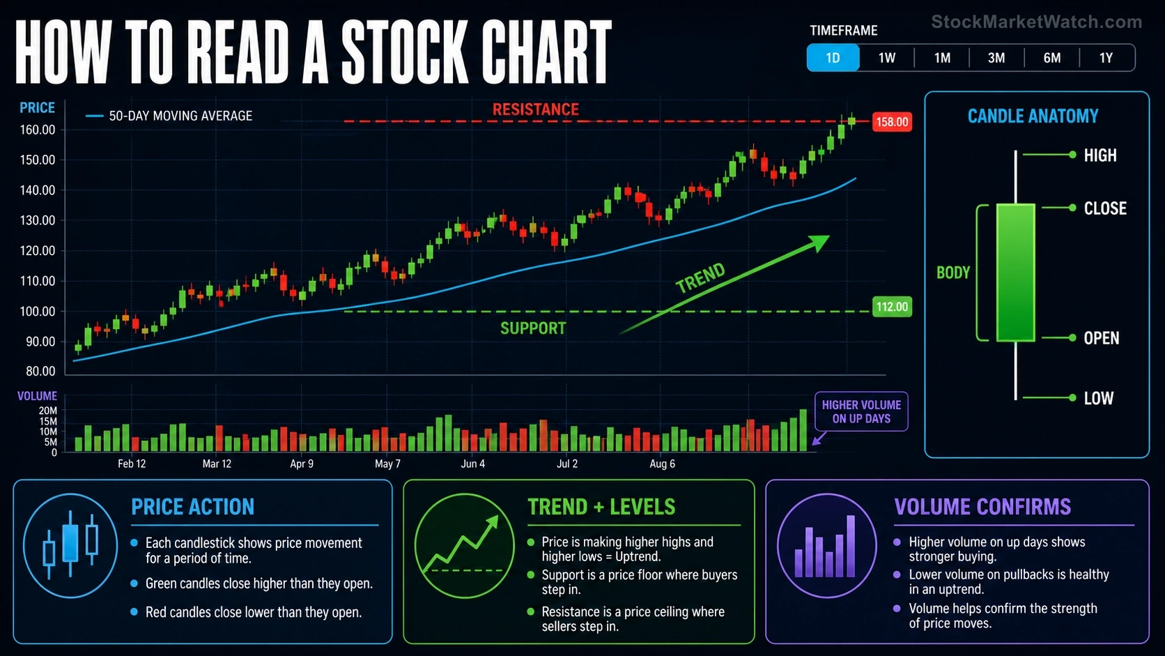
Each candlestick summarizes one period with four prices — open, high, low, close (OHLC):
- The body (the thick part) spans open to close: green/white when the close is higher (buyers won the period), red/black when lower (sellers won).
- The wicks (thin lines above and below) mark the high and low — the ground fought over but not held.
The shapes are legible once you know the grammar: a long green body with no wicks is total buyer control (a marubozu); a long upper wick on a small body says buyers pushed high and got rejected. Whole vocabularies of these one-, two- and three-candle formations exist — our bullish and bearish candlestick references cover every major one — but the grammar above is 80% of the reading.
Volume: The Conviction Meter
The bar chart along the bottom is volume — how many shares traded each period. It grades the price action above it: a breakout on triple average volume has crowds behind it; the same move on thin volume is a rumor. As a rule of thumb, healthy trends see volume expand in the trend's direction and fade on pullbacks. Price says what; volume says how many people meant it.
Timeframes: Same Stock, Different Stories
A chart of daily candles covering a year tells a different story than 5-minute candles covering today — and both are true. The practical habit is top-down: check the weekly or daily chart for the big trend first, then zoom in only as your decision requires. Most long-term investing questions are answered entirely on the daily and weekly views; the minute charts exist for traders working the intraday playbooks.
Trend: The First Question
Before any pattern or indicator, one question: which way is this drifting? An uptrend makes higher highs and higher lows; a downtrend, lower highs and lower lows; everything else is a range. Two visual aids make trends easier to see: trendlines (a straight line along the swing lows of an advance or swing highs of a decline) and moving averages — smoothed price lines like the 50-day and 200-day that summarize the trend at a glance. Price living above a rising 200-day average is the simplest one-look health check in charting.
Support and Resistance: The Market's Memory Levels
Support is a price area where declines have repeatedly stopped — buyers remember it as cheap. Resistance is where advances have stalled — sellers remember it as expensive. These levels form at prior highs and lows, round numbers, and heavy-volume zones, and they matter because thousands of participants remember the same picture and act on it. When a level finally breaks — price pushing decisively through resistance on strong volume — old resistance often becomes new support, and the market's memory resets. That mechanic underlies most of the chart patterns you'll meet later.
Reading a Chart in 30 Seconds
- Zoom out (1-2 years, daily or weekly): what's the trend?
- Find the levels: where has price repeatedly stopped, top and bottom?
- Check volume: do recent moves have conviction behind them?
- Locate today: is the current price mid-range (no-man's land), at support (decision zone), or breaking a level (event)?
That sequence, applied to any chart on this site — every ticker's page carries a full chart and a technical indicator workup — turns a squiggle into a situation report.
Next, the final lesson of the course: bull markets, bear markets, and the cycle — the chart pattern that plays out over years instead of days.